


J-höm; is a continuation of the J-mat; line, which has already won the trust and appreciation of women. Now it's the male half's turn! J-höm; or homme means ‘man’ in French. The two dots above the o in the name are a trademark of Masaki's style.
A white bottle for her and a dark blue bottle for him complement each other like yin and yang. This conceptual design emphasises the image of the Japanese fashion designer. J-höm; has a charismatic and determined signature that gives men charm and self-confidence. J-höm; is aimed at the determined, balanced and artistic young man who lives a dynamic life but has not lost his sense of freedom.
The J-höm; fragrance
The fragrance consists of a combination of bamboo and driftwood, which lends it freshness. The woody, spicy scent emphasises individuality and masculinity. Bamboo brings an undeniable woody, aquatic freshness. This coolness is further enhanced in the top note by cardamom and Sicilian lemon. A heart note of woody reed and cashmere is accompanied by amber and slightly maritime driftwood, which gives the fragrance its clear facet. A pleasantly sensual base of crystal musk harmonises with elegant amber and woody patchouli notes at the end.
The perfumer's inspiration
‘With J-höm, the bottle's urban design and elegant combination of white and blue immediately put me on the trail of a decidedly modern and young creation. I imagined the scent of an elegant man who moves with the times, lives at the pace of a metropolis and remains completely relaxed.’ – Leonardo Lucheze
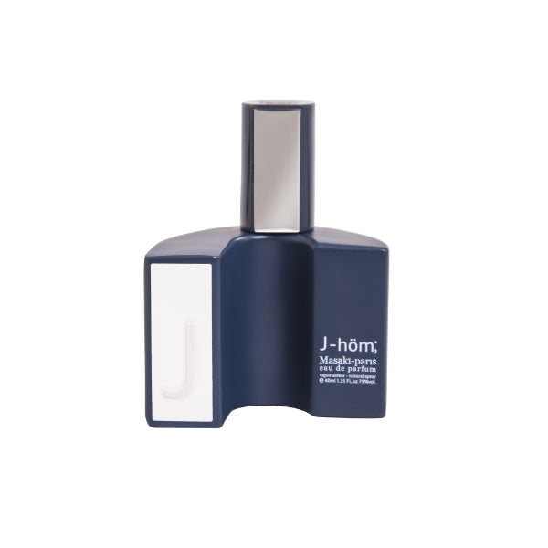
The bottle
The bottle has a casual style and is finished in a dark, cool blue. In Japan, the colour blue is associated with purity and tranquillity, as well as with the concept of youth.
The shape of the bottle represents the letter J, which stands for:
Joy: ‘Joy is a spiritual practice of saying yes to life.’ (Mark M.);
Jeunesse (‘youth’ in French), a synonym for future, expectation and hope;
Japan, the land of the rising sun, always an inspiration for Masaki.
The letter J is also engraved on the central vertical white border. For men, white was chosen because of its significance in Japanese culture – it is a sacred colour of the gods. The Emperor of Japan wears white clothing during the most important Shinto rituals. The bottle is matt and comfortable to hold. The cap is shiny with a silver plate and the name Masakï-paris on the upper edge.
The packaging
The matte kraft cardboard box is in the same colours as the bottle, both matching and complementing each other. The silver and white stripes were designed in the style of Japanese calligraphy. The silver colour is another reference to masculinity in the design of the bottle and packaging, which symbolises wealth and prestige according to Japanese interpretation.