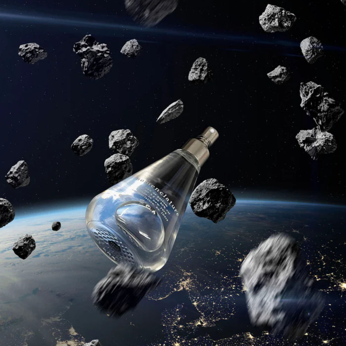


Orbitone
It softens other materials, appeases tensions between musk, woody and floral notes, and makes perfume blends light as clouds… Since the early 1990s, “the transparent woody-ambery odor of Iso E Super has shaped and defined modern perfumery like hardly any other material,” writes the fragrance chemist Philip Kraft. With Orbitone, Takasago offers a sophisticated, surprisingly textured version of this indispensable molecule.
The Scent: Wood in Orbit
Orbits are the result of a perfect balance between momentum and gravity. And in orb_ital, Patricia Choux has brilliantly used the balancing qualities of her star molecule to create a new fragrant planetary system. Violet and rhubarb; pepper, cedar and roast coffee; tobacco, smoke, and a whiff of struck match… Of the many facets spinning around Orbitone the perfumer has picked pepper as the main force of attraction. The spice’s cool-hot burn acts from top to base notes in orb_ital, exerting its pull on a creamy sandalwood compound, Takasago’s Hindinol, anchored by sacred olibanum.
The Packaging
Like the lab-designed molecules that inspired the fragrances, Nomenclature’s packaging offers elegant solutions to a series of practical problems. Namely: protecting the bottle; showcasing the scent; expressing the concept. The result is a statement of design and modernity: spare, beautifully functional, and unique in the world of fragrance.
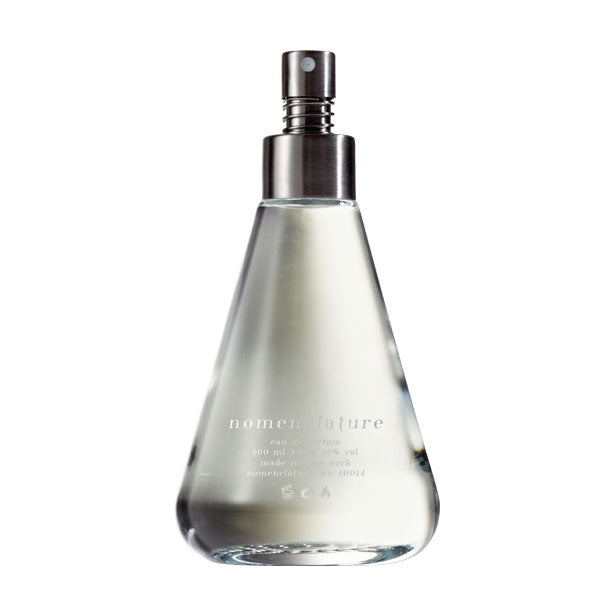
The Bottle & Sprayer
The flacon is inspired by the pure, simple lines of the classic Erlenmeyer flask, as a tribute to the chemistry labs where aromatic compounds are designed. As the bottle moves, stunning hologram-like effects rise from the “impossible molecule” patterns embossed at the bottom. To keep the overall design as spare as possible, there is no cap: the brushed stainless steel sprayer is equipped with a coil spring that prevents it from being pressed by accident. The sprayer can be unscrewed, so that the bottle may be repurposed.
The Box
Conceived as a 360° cradle that protects the bottle while displaying it, the box is made up of a white cardboard “shell” that folds around the bottle like origami, held together by a white paper sleeve. No ink, no colors: only essential white. The sleeve is adorned with a metallic logo. To add a tactile experience, both shell and sleeve are debossed with an “impossible molecule” design.
Nomenclature’s Impossible Molecules
The patterns adorning the box and bottle are “impossible molecules” that follow none of the laws of chemistry. These were designed to avoid referring to any specific ingredient, while conjuring the elegant, evocative abstraction of molecular diagrams.