


With this new line, designer Masakï Matsushïma wanted to send a strong message in these uncertain times: the name Sunshïne and the colours are messengers of optimism and good cheer.
He found inspiration in his Japanese roots. The sun plays an important role there (mythology, Buddhism), is a symbol on the flag and is traditionally celebrated with Hatsuhinode, the festival of the first sunrise of the year. Japan's other name is the ‘Land of the Rising Sun’.
The fragrance
Created in collaboration with perfumer Jérôme di Marino, it is designed for the young women of this millennium. The round, yellow bottle, reminiscent of a small sun, exudes fruity and floral notes. An ideal fragrance for all year round, giving the impression of prolonging summer forever.
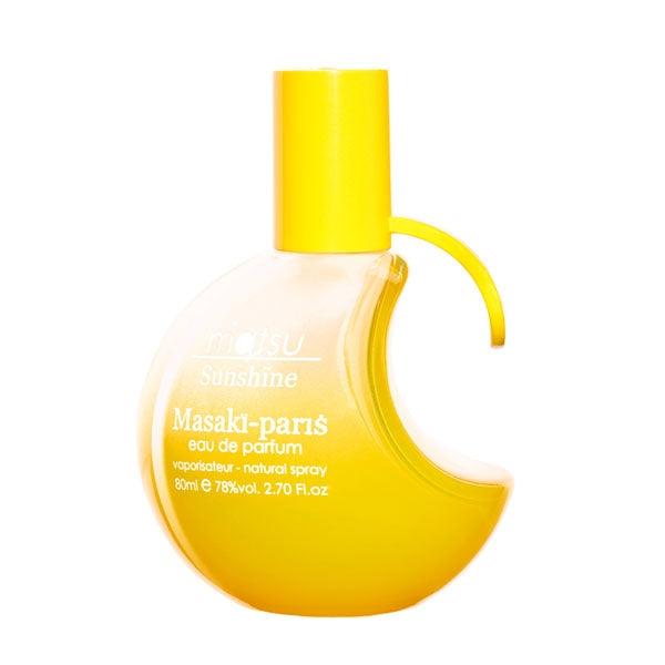
The bottle
The minimalist design of the Matsu collection was chosen by the designer to highlight the bright yellow colour and white lettering of the bottle. The ï in Sunshïne is a nod to its own name. The round and luminous curves of this smooth glass bottle symbolise the sun. The graduated yellow that covers it is reminiscent of the rising or setting of this life-giving star. The bright yellow cap refers to the constant light of this star and enhances the feeling of well-being.
The packaging
The packaging is a sunny yellow colour and the white lettering is both modern and gentle, in harmony with the colours of the bottle. The front of the packaging depicts the Japanese culture from which Masakï Matsushïma draws his inspiration with two strongly associated symbols: the sun symbol is harmoniously coordinated with the name and symbol of Matsu.
The fragrance is floral, fruity and woody. A tangy lemon and a deliciously appetising fig compete for attention in the top notes. The sunny, floral heart of an extravagant ylang-ylang is blended with the freshness of yellow freesia. The base: luminous sensuality enveloped in a hint of hot, musk-tinged skin.
