


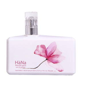
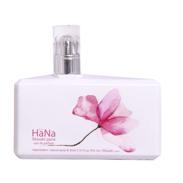
Hana (花) means flower in Japanese and also symbolises transience, perfection, innocence and youth. Japan has its own language of flowers – hanakotoba – which often appears in modern pop culture. These blooming beauties dominate art, clothing and even national symbolism there. The three dots at the top are an element that emphasises Masakï's individual style.
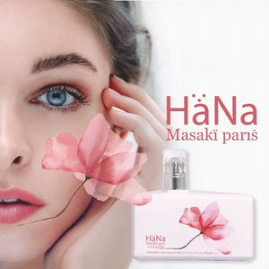
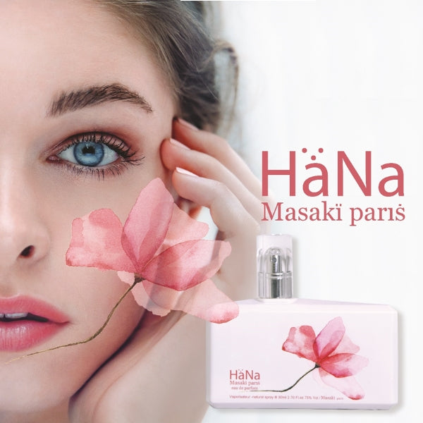
Hana was developed in collaboration between designer Masaki Matsushima and perfumer Leonardo Lucheze. The fragrance has its own character – elegant, seductive and enticing: exactly what a young woman wants to be when she chooses her fragrance. The combination of lychee, rose and crystalline musk conveys femininity and emphasises her uniqueness and beauty.
‘A single flower holds more splendour than a hundred flowers’ – Yasunari Kawabata, Japanese writer
Hana opens with sparkling notes of bergamot combined with green tea and crisp, fruity notes of pear and lychee. In the heart, a bouquet of rose, lily of the valley and wisteria gives the fragrance its refreshing floral character. Watermelon, fresh white cedarwood, sandalwood and crystalline musk give the drydown the pleasant impression of a second skin.
Inspiration of the perfumer
‘I was inspired by the bottle with its wondrous flower. I wanted to create something light, floral and delicate. A fragrance that transports the wearer to a summer meadow where the wind blows through the flowers. I see an elegant, sophisticated and spontaneous young woman.’
The bottle
The bottle is painted white with a 3D image of a pink flower. White was chosen because it symbolises spiritual and physical purity. It is shaped like a crescent moon. In Japan, the moon traditionally represents feminine energy. The aster is an eternal object of worship and inspiration for Japanese poets, and Masaki is no exception.
The flower is drawn in a watercolour style. The stem of the flower is rendered in the Japanese sumi-e technique, which uses only black ink to create a monochrome image. Pink, the colour used to depict the flower, is also associated with its meaning in Japanese culture – the colour of dawn, the emergence of new life, the invincibility of the passage of time.
The packaging
The box is kept in a minimalist style, laconically combined with the bottle. The use of an imaginary flower supports the avant-garde style concept of the design. These elements underline the appreciation of Japanese culture and Masaki's view of the world.

