


Helvetolide
Part of the latest generation of synthetic musks (the oldest one goes back to 1888), Helvetolide is particularly valued for its delectable pear note, reminiscent of ambrette, a vegetal musk extracted from hibiscus seeds. It was patented in 1991 by the Swiss company Firmenich, hence its name, derived from Helvetia, the Latin term for Switzerland.
The Scent: Zero Gravity Musk
Helvetolide gives off a softly enveloping, long-lasting aura; an otherworldly feeling of stillness and weightlessness. Rather than using Helvetolide in a “classic” way to enhance other notes, Frank Voelkl boosts its ethereal vibe in a futuristic composition that seems to conjure the scent of zero gravity. A pink pepper comet brings out its fruitiness.
Cool, metallic iris underlines its affinities with ambrette (which has an iris facet). A nebula of vanilla, tonka bean and ambergris underline its sensuousness. In German, adrett means “neat” or “dapper”: in this spare, smartly trimmed scent, each element is essential – as it would be in outer space.
The Packaging
Like the lab-designed molecules that inspired the fragrances, Nomenclature’s packaging offers elegant solutions to a series of practical problems. Namely: protecting the bottle; showcasing the scent; expressing the concept. The result is a statement of design and modernity: spare, beautifully functional, and unique in the world of fragrance.
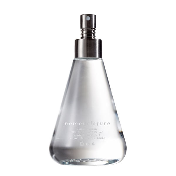
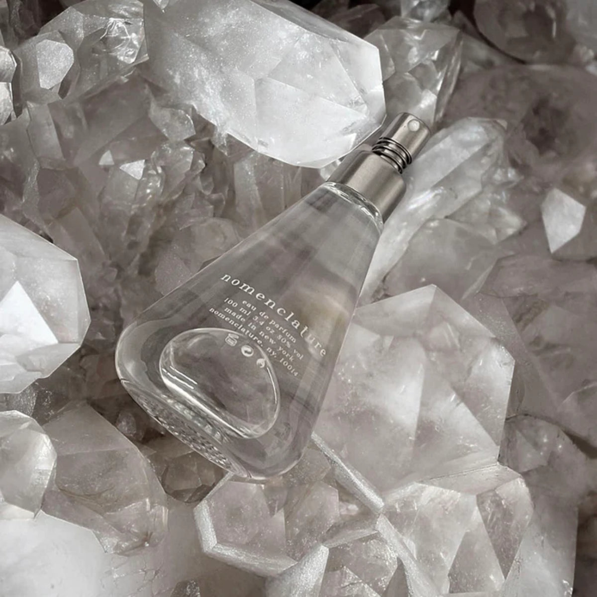
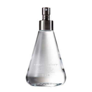
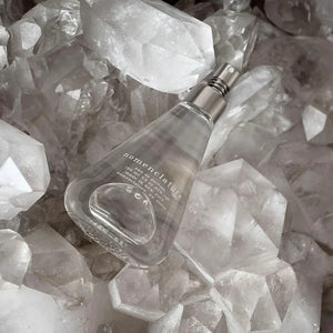
The Bottle & Sprayer
The flacon is inspired by the pure, simple lines of the classic Erlenmeyer flask, as a tribute to the chemistry labs where aromatic compounds are designed. As the bottle moves, stunning hologram-like effects rise from the “impossible molecule” patterns embossed at the bottom. To keep the overall design as spare as possible, there is no cap: the brushed stainless steel sprayer is equipped with a coil spring that prevents it from being pressed by accident. The sprayer can be unscrewed, so that the bottle may be repurposed.
The Box
Conceived as a 360° cradle that protects the bottle while displaying it, the box is made up of a white cardboard “shell” that folds around the bottle like origami, held together by a white paper sleeve. No ink, no colors: only essential white. The sleeve is adorned with a metallic logo. To add a tactile experience, both shell and sleeve are debossed with an “impossible molecule” design.
Nomenclature’s Impossible Molecules
The patterns adorning the box and bottle are “impossible molecules” that follow none of the laws of chemistry. These were designed to avoid referring to any specific ingredient, while conjuring the elegant, evocative abstraction of molecular diagrams.